SSRS 2008 – Range Bar Chart (GANTT CHART)– Step By Step
Hi Folks,
This is my first post on SSRS 2008. I have been working on this SSRS 2008 for almost 6 months from now. I have started using the range bar chart which is very interesting. I searched over internet for more details on this but of now use. With my experience I prepared a step-by-step introduction to GANTT chart so that developers will get a good starting point for developing GANTT Chart using SSRS 2008.
Main Criteria for Range Bar Chart is the data that is used to display in the graph.
The dataset that is used should return at least three details.
· Task Name
· Start Date,
· Duration or End Date for the task.
Assuming that my dataset returns all the three details, I am going ahead to create the Gantt Chart.
My dataset returns TaskName, StartDate, EndDate.
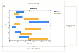
From Tool window, drop the Chart control in report body and you will see the below window, and select Range Bar chart as heighted below.
After clicking OK, this what you see in the report body.
Let’s discuss something about what we see here.
Category Fields:
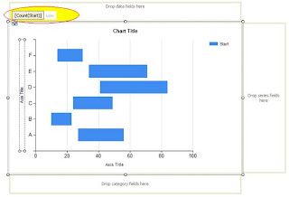
This is the area where you will drop your fields to group the data, here I dropped the TaskName. So data is now grouped by TaskName. You can have multiple fields in category fields. I tried with 4 categories, and it worked like a champ.
Right click on the dropped category fields, select Category Group Properties.
Data Fields:
This is the section where we specify our start and end dates for the tasks. The fields you drop here has High and Low values (like a pair High, Low values). It’s highlighted in the image below.
Now Right Click on the dropped, and field and select Series Properties. This is the very important information that needs to be updated.
Here Top value can be EndDate or (Duration + StartDate) and the Low value is StartDate. You can click on Fill and specify a color for this series Bar.
Now Click on the dropped field, and it will select the series in the graph. Right click on this and select Show Data Labels.
Interestingly SSRS 2008 is very flexible in showing the labels, and colors for the bar dynamically based on expressions you define. This is screen you see after selecting the Show Data Fields.
SSRS 2008 provides wide range of options to control the data series bar. I am going to discuss a few here and you can explore more.
Let me start with the label text. By default it shows the date as the label text. But in most of the cases we may need to show the Task Name or Subtask Name. Here what you need to do. Select the data series by clicking on the graph data series bar or clicking on the data fields section and open the Properties window (not the right click series properties) (Ctrl W P).
If you observe there is Boolean field UseValueAsLabel with value True. Because of this, it shows the date as label text by default. If you want custom label text, then change this to false and change the Label field here. I changed it to display TaskName by changing the Label value to “Fields!TaskName.Value”. You can have custom expression to populate the label. You can also customize the font colors, font widths, formatting borders for this label in this label section.
Now we move to the CustomAttributes section. This is very important part for the Gantt Chart for customization. Now let’s see what is there in it and how you can modify according to our requirements. I am discussing only the options I have explored till now.
This controls the label text alignment. Available values or Center,Left,Right,Outside. Selecting outside will show the label, just before the data series bar. You can select any value, and the default value is Center.
DrawingStyle:
This controls the drawing style like cylinder type bar or regular bar. Here is the list:
DrawSideBySide:
This is very interesting attribute. Here is example where we can use it.
I have a task with multiple subtasks and all my sub tasks are sequential (like first task end date is second task start date). In this case I want to show all the bars in same line, and with different colors. By setting value to “False”, this will allow us to show all data series bars related same grouping category to be displayed in the same line like shown below.
To view all the sub task data series group in one line, you need to set this DrawSideBySide to False for all the sub task data series.
PointWidth:
This is the field that controls the data series bar width. Maximum value is 1, and minimum value is 0. As you can see the default value is 0.8. If you want see like a line, then you can give like 0.05 or 0.1
In the same properties window, you can customize any field like Color with custom expressions.
Customizing the Axis Properties:
Right click on the Value Axis (X-Axis), select Value Axis Properties.
Under Axis Options, you have various options to customize the labels to be shown. By default it will show the date in short date format.
If you run the report, by default it will show only alternate labels both in X and Y axis. To view all the labels you need to check the check box Enable Variable interval. This is very common thing we may tend to forget.
You can give a specific Minimum, and Maximum values. You can specify an expression like Minmum is MIN(Fields!Start.Value) and Maximum is MAX(Fields!EndDate.Value).
Interval, Interval Type: I guess the name says it all. What is the interval (digit) and what is the interval type (Hours, Minutes, Weeks, Days, ..) you want to show in the value axis. Accordingly you can change the display format in Number section. If you want to show the dates in HH:MM format, you can change it like given below.
Or you can give any specific format you want. You can check out the options available for Labels, Label font sections here.
If you select the value axis (x-axis) and go to properties window you will see a wide range of fields you can customize. You can specify minor, major grid intervals, with specific colors, widths. You can always hide the axis (both X and Y) and you can hide the minor major grids and also minor major grid ticks.
Major, Minor grids applicable to chart area and major, minor grid ticks applicable to the labels section of the grid
Most of the properties are applicable to Y Axis as well (Series Axis Properties).
And here is the final Report out I got with Interval type Hours.
Here are some Gantt Charts report outputs I developed using SSRS 2008 Range Bar Chart:
The above gantt charts are developed using multiple GANTT Charts with the same set of data.
Hope this is helpful
Hi All I just posted another blog on this topic which as video tutorials of implementing the GANTT chart:
GANTT Chart using SSRS 2008 R2
GANTT Chart using SSRS 2008 R2
Swamy


