Tuesday, November 18, 2014

Sending email with smtp.gmail.com in ASP.Net MVC


Recently I started working on sending an email from an ASP.Net MVC application, while checking on the internet everybody is giving the base code for sending an email. I was trying to use smtp.google.com as my SMTP server with port 587. I was always getting an error server actively rejected my connection. Nobody is giving concrete information on enabling settings on gmail account settings. I used to get an email from Gmail saying un-authorized access to my account is blocked. And the email has a link to allow less secure app settings, which allows us to login from different devices and applications using our own settings. You need to enable to send email from your application.

Here is the URL for gmail settings: Gmail Settings

Also verify settings for Antivirus installed on your machine. By default, it will block the connection. You can verify the same in Event Viewer -> Application logs - look for any Warning/Information messages related to this connection. You may find some thing like this:
Blocked by port blocking rule (Anti-virus Standard Protection:Prevent mass mailing worms from sending mail). And a warning message showing the same message as the exception you got from the code.

You need to uncheck the setting for "Prevent mass mailing worms from sending mail" in you Anti-virus software. Here is the snapshot for the same for McAfee.

Please refer to anti-virus settings as the settings may differ based on the Anti-virus installed on your machine. If Anti-virus is blocking the connection you may the following exception form your code

No connection could be made because the target machine actively refused it 74.125.207.109:587

If Gmail setting is disabled you may get the following exception from your code

The SMTP server requires a secure connection or the client was not authenticated. The server response was: 5.5.1 Authentication Required. Learn more at


Here is an example code I used to send email using Google SMTP server after enabling my Gmail settings for my account and updating Anti-virus settings on my machine.

To send content, you need to use AlternativeView.

Namespace: System.Net.Mail

Create mail message:


var mailMessage = new MailMessage
{
From = new MailAddress("user@gmail.com", "firstname, lastname"),
Subject = "Test message"
};

// add TO list
mailMessage.To.Add(new MailAddress("user1@gmail.com", "user1-display-name-is-optional"));
mailMessage.To.Add(new MailAddress("user2@gmail.com", "user2-display-name-is-optional"));
// add CC list
mailMessage.CC.Add(new MailAddress("user3@gmail.com", "user3-display-name-is-optional"));
mailMessage.CC.Add(new MailAddress("user4@gmail.com", "user4-display-name-is-optional"));
// add Bcc list
mailMessage.Bcc.Add(new MailAddress("user5@gmail.com", "user5-display-name-is-optional"));
mailMessage.Bcc.Add(new MailAddress("user6@gmail.com", "user6-display-name-is-optional"));

Create SMTP Client:

var gmailClient = new SmtpClient
{
Host = "smtp.gmail.com",
Port = 587,
Credentials = new NetworkCredential("user1@gmail.com", "password"), // user1 is same as From mail
EnableSsl = true
};

To Send HTML Content:


var htmlText = "<h3>This is html text</h3> <br />Hello<br />" +
"<br /><img src=\"cid:myImageId\"/>";

var htmlContent = AlternateView.CreateAlternateViewFromString(htmlText, null, MediaTypeNames.Text.Html);

// TO linking our image as an embedded resource
var myPicture = new LinkedResource("G:\\Temp\\Capture.JPG", MediaTypeNames.Image.Jpeg)
{
ContentId = "myImageId"
};

htmlContent.LinkedResources.Add(myPicture); // Linking the image
mailMessage.AlternateViews.Add(htmlContent);

To Send Plain Text:

var normalText = AlternateView.CreateAlternateViewFromString("This is normail Text...", null, MediaTypeNames.Text.Plain);
mailMessage.AlternateViews.Add(normalText);

To Send Attachments:

 mailMessage.Attachments.Add(new Attachment(@"G:\Temp\readme.txt"));
Note: You have other options of adding streams to attachments.

Send Email:

gmailClient.Send(mailMessage);


Hope this helps.

Saturday, December 29, 2012

SSRS 2008 R2 - Range Bar Chart (GANTT) - updated


Hi All,

Sorry for not posting any updates on my blog. 

Anyways I just updated the Range bar chart (GANTT) using SSRS 2008 R2 Business Intelligent Studio. And here is the actual output of the report:


Here are the video tutorials of implementing this report:

Part 1

Part 2


Click HERE to download the RDL file (File -> Download) for this Range Bar Chart Report.

Below given details are references for you guys:

How to implement this Report:
The below given image has all regions identified to implement this report:


In the above picture, all marked regions (1, 2, 3, and 4) are individual Range Bar Charts with updated properties and properly aligned for the look and feel. 


SELECT TaskId, TaskName, StartDate, EndDate, SubTaskId,
      CONVERT(datetime, '1/1/2012') AS TempStart, CONVERT(datetime, '12/12/2012') AS TempEnd
FROM
(
      SELECT TaskId, TaskName, StartDate, EndDate, 0 AS SubTaskId FROM Task
      UNION
      SELECT TaskId, TaskName, StartDate, EndDate, SubTaskId FROM SubTask
) AS tasks
ORDER BY TaskId, SubTaskId


The query is returning the following fields:


  • TaskId
  • TaskName
  • StartDate
  • EndDate
  • SubTaskId
  • TempStart
  • TempEnd
For time being ignore the fields TempStart, and TempEnd. Let's start with chart. Right click on the Report design area and insert a Range Bar Chart to report.


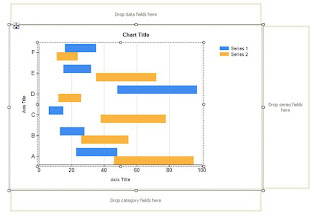
After adding the chart to report the chart looks like this:
As you can observe, this part is little different than in SSRS 2008.  Values is where we select the date range fields, and Category Groups is where we add columns to group data. I added EndDate to Values. Select the EndDate and right click select "Series Properties" and update the series as given below.


As you can see I also added TaskId and SubTaskId to the Categories Groups. You can right click on each of the Category Group select "Category Group Properies" to change the sort options. As I added integer fields, I am changing my sort direction to Z - A form A-Z. Here is how the properties window looks like:

Repeat the same for SubTaskId Category Group As well. Once this is done, let us get rid of all the titles, legends, and Vertical Axis. For titles you can simply select and delete. For Vertical Axis, select the Axis and uncheck "Show Axis". Now the report should look like this:
And the report output should look like:
Now Go back to Design mode and select the Horizontal Axis, right click select "Horizontal Axis Properties".


  • Select Labels -> then check "Hide axis lables" checkbox.
  • Select Major Tick Marks -> then check "Hide major tcik marks" checkbox


Now when you view the report it should look like this:
As you can see except the margins, rest is looking good. You can update the label for the Series in the chart as explained in my previous post. Before discussing how to remove the margins, let me explain some customization you can do with the Major/Minor Grid Lines for Horizontal Axis. Select the Horizontal Axis, and go to the properties window. Here you see two important sections that controls Major and Minor Grid Lines. 


As you can see both Major Grid Lines and Minor Grid Lines has same fields. Here is how we can use it.


  • Enabled : This has values of Auto, False, True. False will make them not to be shown in the chart, and True does show the lines on the chart. I will explain later about Auto option, for time being you can change the value to True.
  • Interval Type:  This is very important fields which controls where to show the lines. It has the following values. 
  • Interval : This is an integer field. You set the interval between the lines.


If you set Interval Type as Months and Interval as 2, then for each two months in the chart you can see grid line. And the remaining fields under this group are to control the line style and color. I let you guys to play around it. You can set different colors for Major and Minor grids. You can hard-code the Interval and Interval Tyoe. Or a better options would be to have two Report Parameters MyInterval and MyIntervalType  and use these in the formula expression. I will leave it to you guys to play with these parameters.

Now we go back to removing the margins for the chart area. I am saving this for last because once the margins are removed it is difficult to select individual parts of chart in design areas. Go to design mode, and click on the chart. Now click again to select the chart area. On the properties window ensure Chart Area is selected. It has the following two properties.

  • CustomInnerPlotPosition
  • CustomPosition

By default both properties has Enabled property set to False. You make it to True to change the Height and Width of chart area. Both Height and Width are set to value from 0 - 100, which means it is a percentage. CustomInnerPlotPostion will let you control the Height and Width of the chart area. And CustomPosition will let you control the area of the chart within the selected chart area. Here are some exaples:


I set the CustomPosition and CustomInnerPlotPosition to 100.

Now we go to the Months bar chart. Here is how you can do that. Copy the current chart and paste it in the report. Now we modify the copy to look like the the Months bar.
Select the copies chart. Go to properties window, select Chart Areas collection. This is another way you can go to the CustomInnerPlotPosition and CustomPosition properties. I changed the CustomInnerPlotPostion as given below.


Now Select the Horizontal Axis, and go to properties window. Set LabelsFormat to '="MMM"' and MajorTickMarks -> Enabled to True.  You can check other parameters like LabelInterval, and LabelIntervalType to control at what interval to show the labels.
Now Chart Data -> Select EndDate, Go to Properties Window. Now update the CustomProperties -> PointWidth to 0.
Now click on the report, and click again to select the chart area. Go to Properties window -> CustomInnerPlotPosition. Set Height to 0.01
Then adjust the height of the report, and align with the original report like shown below. You can also view the output of the report given below.
Now we are almost done with the Months bar. You can copy and paste this Months chart and modify the Lables format to '="yyyy"' to get years and Change the Interval to 1, and IntervalType to "Years".

Now lets make another copy of the original chart and update some properties to show the task name. Select the copied chart and Chart Data -> Right click on EndDate select Series Properties and change the to TempEnd and TempStart instead of EndDate and StartDate.


Select the TempEnd/TempStart Series. Go to Properties Window, set Lable to =Fields!TaskName.Value


Now Select the Major Grid Lines on this report, right click -> Un-check the check box - Show GridLines

Adjust the width of the chart so that it looks like another column. Here is the how it looks like.


We are almost there .. Now lets start with finishing touches.
First let us give different color for main task and sub task in the Task Name chart. Select the Date Series added to Chart Data. Go to Properties Window -> 
Custom Attributes section:
          Bar Label Style - Set it to Outside
Appearance section:
          Label - set the value to =iif(Fields!SubTaskId.Value = 0, "Silver", "Beige") . This will give Silver color to Main Task and Beige Color to sub tasks (because for main task row, subtaskid will be 0).


And the report output is:

Now we do the same to Main chart.
Select the Chart Data -> EndDate and Go to Properties Window.

Custom Attributes section: 
     BarLabelStyle - set to Outside
     DrawingStyle - set to Cylinder

Appearance section:
     Color - set to expression  =iif(Fields!SubTaskId.Value = 0, "Aqua", "Khaki") . This will give Aqua color to Main task and Khaki color to sub tasks.

Label section:
     Label - set to expression  =DateDiff("D", Fields!StartDate.Value, Fields!EndDate.Value).ToString() + " days" . This will display the task duration in days as label.
      Visible - set this to True


Finally add a Textbox just above the Task Bar chart so that it looks like a Column Header. VerticalAlign the text to Middle, textalign to Center, and give a border and your GANTT chart is ready. Here is the final report output is:

You might be wondering what is the purpose of the database fields TempStart, TempEnd. Here is the reason: Range Bar Chart doesn't show the report if there is no date range. Main task may have a start and end date, but sub-tasks may be having these values as null. And our requirement is to show all the tasks in the chart irrespective of date range. So, I added the columns TempStart, TempEnd which always has default values and I can use this to show the Task Name chart. You can add multiple charts to show other data as well (like Task Name).

You can use formula expressions to controls appearance of the report in many ways. I just explained a couple. 

Please go through the video tutorial added.


Enjoy folks!!!
Cheers,
Swamy


Wednesday, September 1, 2010

Range Bar Chart (Gantt Chart) using SSRS 2008

SSRS 2008 – Range Bar Chart (GANTT CHART)– Step By Step
Hi Folks,
This is my first post on SSRS 2008. I have been working on this SSRS 2008 for almost 6 months from now. I have started using the range bar chart which is very interesting. I searched over internet for more details on this but of now use. With my experience I prepared a step-by-step introduction to GANTT chart so that developers will get a good starting point for developing GANTT Chart using SSRS 2008.
Main Criteria for Range Bar Chart is the data that is used to display in the graph.
The dataset that is used should return at least three details.
·         Task Name
·         Start Date,
·         Duration or End Date for the task.
Assuming that my dataset returns all the three details, I am going ahead to create the Gantt Chart.
My dataset returns  TaskName, StartDate, EndDate.
From Tool window, drop the Chart control in report body and you will see the below window, and select Range Bar chart as heighted below.

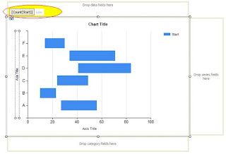
After clicking OK, this what you see in the report body.
Let’s discuss something about what we see here.
Category Fields:
This is the area where you will drop your fields to group the data, here I dropped the TaskName. So data is now grouped by TaskName. You can have multiple fields in category fields. I tried with 4 categories, and it worked like a champ.
Right click on the dropped category fields, select Category Group Properties.
Here you can control the label text.
Data Fields:
This is the section where we specify our start and end dates for the tasks. The fields you drop here has High and Low values (like a pair High, Low values).  It’s highlighted in the image below.

Now Right Click on the dropped, and field and select Series Properties. This is the very important information that needs to be updated.
Here Top value can be EndDate or (Duration + StartDate) and the Low value is StartDate.  You can click on Fill and specify a color for this series Bar.
Now Click on the dropped field, and it will select the series in the graph. Right click on this and select Show Data Labels.
Interestingly SSRS 2008 is very flexible in showing the labels, and colors for the bar dynamically based on expressions you define.  This is screen you see after selecting the Show Data Fields.
Customizing the series bar:
SSRS 2008 provides wide range of options to control the data series bar. I am going to discuss a few here and you can explore more.
Let me start with the label text. By default it shows the date as the label text. But in most of the cases we may need to show the Task Name or Subtask Name. Here what you need to do. Select the data series by clicking on the graph data series bar or clicking on the data fields section and open the Properties window (not the right click series properties) (Ctrl W P).

If you observe there is Boolean field UseValueAsLabel with value True. Because of this, it shows the date as label text by default. If you want custom label text, then change this to false and change the Label field here. I changed it to display TaskName by changing the Label value to “Fields!TaskName.Value”. You can have custom expression to populate the label. You can also customize the font colors, font widths, formatting borders for this label in this label section.
Now we move to the CustomAttributes section. This is very important part for the Gantt Chart for customization. Now let’s see what is there in it and how you can modify according to our requirements. I am discussing only the options I have explored till now.
BarLabelStyle:
This controls the label text alignment. Available values or Center,Left,Right,Outside. Selecting outside will show the label, just before the data series bar. You can select any value, and the default value is Center.
DrawingStyle:
This controls the drawing style like cylinder type bar or regular bar. Here is the list:
DrawSideBySide:
This is very interesting attribute. Here is example where we can use it.
I have a task with multiple subtasks and all my sub tasks are sequential (like first task end date is second task start date). In this case I want to show all the bars in same line, and with different colors. By setting value to “False”, this will allow us to show all data series bars related same grouping category to be displayed in the same line like shown below.

To view all the sub task data series group in one line, you need to set this DrawSideBySide to False for all the sub task data series.
PointWidth:
This is the field that controls the data series bar width. Maximum value is 1, and minimum value is 0. As you can see the default value is 0.8. If you want see like a line, then you can give like 0.05 or 0.1
In the same properties window, you can customize any field like Color with custom expressions.
Customizing the Axis Properties:
Right click on the Value Axis (X-Axis), select Value Axis Properties.
Under Axis Options, you have various options to customize the labels to be shown. By default it will show the date in short date format.
If you run the report, by default it will show only alternate labels both in X and Y axis. To view all the labels you need to check the check box Enable Variable interval. This is very common thing we may tend to forget.
You can give a specific Minimum, and Maximum values. You can specify an expression like Minmum is MIN(Fields!Start.Value) and Maximum is MAX(Fields!EndDate.Value).
Interval, Interval Type: I guess the name says it all. What is the interval (digit) and what is the interval type (Hours, Minutes, Weeks, Days, ..) you want to show in the value axis.  Accordingly you can change the display format in Number section. If you want to show the dates in HH:MM format, you can change it like given below.
Or you can give any specific format you want.  You can check out the options available for Labels, Label font sections here.
If you select the value axis (x-axis) and go to properties window you will see a wide range of fields you can customize. You can specify minor, major grid intervals, with specific colors, widths. You can always hide the axis (both X and Y) and you can hide the minor major grids and also minor major grid ticks.
Major, Minor grids applicable to chart area and major, minor grid ticks applicable to the labels section of the grid
Most of the properties are applicable to Y Axis as well (Series Axis Properties).
And here is the final Report out I got with Interval type Hours.
You can always customize the legends for the chart.
Here are some Gantt Charts report outputs I developed using SSRS 2008 Range Bar Chart:

Another example:

The above gantt charts are developed using multiple GANTT Charts with the same set of data.
Hope this is helpful
Hi All I just posted another blog on this topic which as video tutorials of implementing the GANTT chart:
GANTT Chart using SSRS 2008 R2

Swamy